

Julie Silverstein & Partners
JS & Partners is a consulting firm that provides guidance in CEO on-boarding for both profit and nonprofit organizations. As the company’s pragmatic CEO with decades of experience, Julie Silverstein assists in maximizing their natural skills, behaviors, and emotional intelligence to navigate C-suite challenges and develop winning strategies.


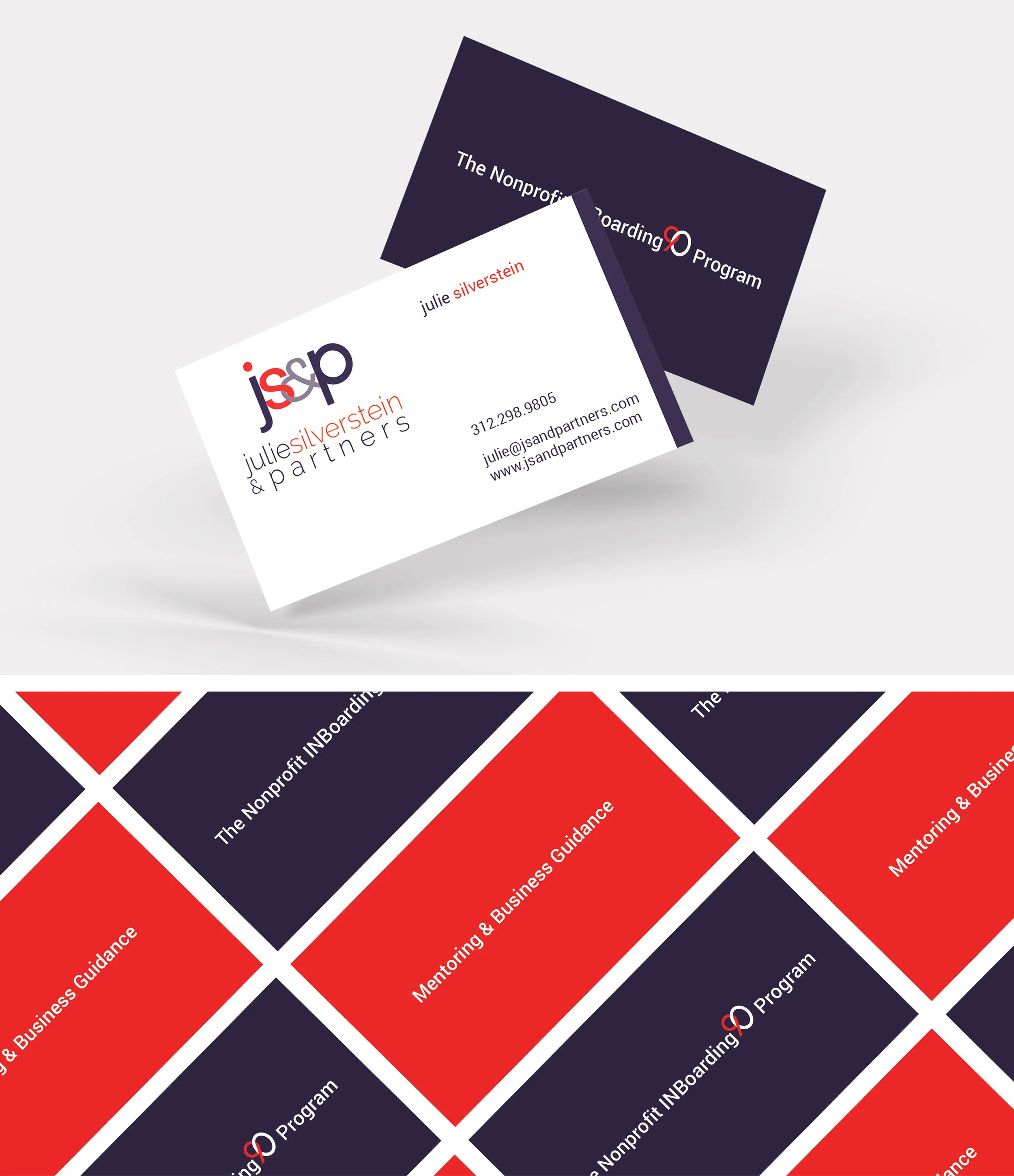
Julie Silverstein required a logo that emanated strength and engagement across it’s visual to reflect the company’s diverse client base within the consulting industry. The result was a play on color (red), depth (gray, purple), and balance (deeper on ends) that effectively “Bookends,” or wrapped, the core of the logo. The central part of the logo provides a bridge between those two bookends, which could be interpreted as profit organizations on one end and nonprofit entities on the other. The ampersand and it’s intermingling with the principal’s initials implies the importance of her leadership skills in collaboration with her team/partners.

Julie requested two double-sided business cards with a bold presence and unique messages. A card with red background featuring “Mentoring & Business Guidance”, alongside a dark blue card promoting "The NonProfit INBoarding 90 Program".
Keeping the brand flow consistent with a strong and straightforward presence, the infographic maps out the client’s action approach to profit-centered success. Colors mirror and compliment the logo layout, symbols enforce the singular focus of each step, and the flow balances out the visual while partnering well with symbols. The infographic, used in conjunctions with the company logo, is well-suited for a postcard mailer or abbrevited print piece to the for-profit target market segment.


